Rolling Regression
In the Linear model for two asset return series example we found that the S&P 500 had a beta of -1 to Treasury returns.
Let’s see if that relationship is stable over time. First we get the two ETF series from Yahoo.
library(zoo)
library(ggplot2)
library(tseries)

spy <- get.hist.quote(instrument="SPY", start="2003-01-01",
                      end=Sys.Date(), quote="AdjClose",
                      provider="yahoo", origin="1970-01-01",
                      compression="d", retclass="zoo")
ief <- get.hist.quote(instrument="IEF", start="2003-01-01",
                      end=Sys.Date(), quote="AdjClose",
                      provider="yahoo", origin="1970-01-01",
                      compression="d", retclass="zoo")
z <- merge.zoo(spy,ief)
We convert to daily log returns.
z.logrtn <- diff(log(z))
This StackOverflow page has a rolling regression function which we can apply to the two series.
rollingbeta <- rollapply(z.logrtn,
                         width=262,
                         FUN = function(Z)
                         {
                           t = lm(formula=SPY~IEF, data = as.data.frame(Z), na.rm=T);
                           return(t$coef)
                         },
                         by.column=FALSE, align="right")
And we plot it
rollingbeta.df <- fortify(rollingbeta,melt=TRUE)
ggplot(rollingbeta.df) + geom_line(aes(x=Index,y=Value)) + facet_grid(Series~.) + theme_bw()
The plot shows that on average the beta of the S&P 500 to Treasury returns is -1, however beta is very variable, and sometimes approaches zero. If we were to plot this over an even longer time-scale we would see periods where the correlation is positive. Alternatively we can reduce the size of the averaging window from one year down to one month to get a more volatile but responsive measure of beta.

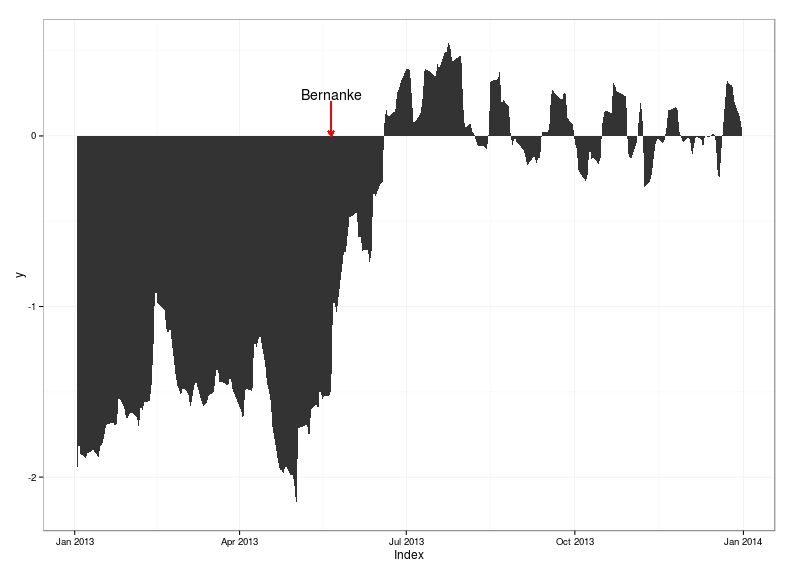
Zooming in on the period just after Bernanke spoke on May 21st 2013 we can see the effect on beta very clearly.
rollingbeta.1m <- rollapply(z.logrtn,
                            width=30,
                            FUN = function(Z)
                            {
                              t = lm(formula=SPY~IEF, data = as.data.frame(Z), na.rm=T);
                              return(t$coef)
                            },
                            by.column=FALSE, align="right")
rollingbeta.tapertantrum <- window(rollingbeta.1m,start="2013-01-01",end="2013-12-31")[,"IEF"]
rollingbeta.tapertantrum.df <- fortify(rollingbeta.tapertantrum,melt=TRUE)

library(grid) # for arrow
bernanke <- as.Date("2013-05-21")
ggplot(rollingbeta.tapertantrum.df,aes(x=Index)) +
  geom_ribbon(aes(ymin=0,ymax=Value)) +
  annotate("text",x=bernanke,y=.21,label="Bernanke",size=5,hjust=0.5,vjust=0) +
  geom_segment(aes(x=bernanke, y=.2, xend=bernanke, yend=0),colour="red", arrow=arrow(length=unit(0.2, "cm"))) +
  theme_bw()
I’ve done this as a shaded plot to highlight periods when the sign of beta switches. You can see that beta flipped to positive following Bernanke’s comments as both Treasuries and equities sold off at the same time. The idea that Treasuries hedge equity clearly didn’t work during this episode even though it does work over the long term. It took a long time for Treasury-equity beta to settle down to its “normal” value of around -1.
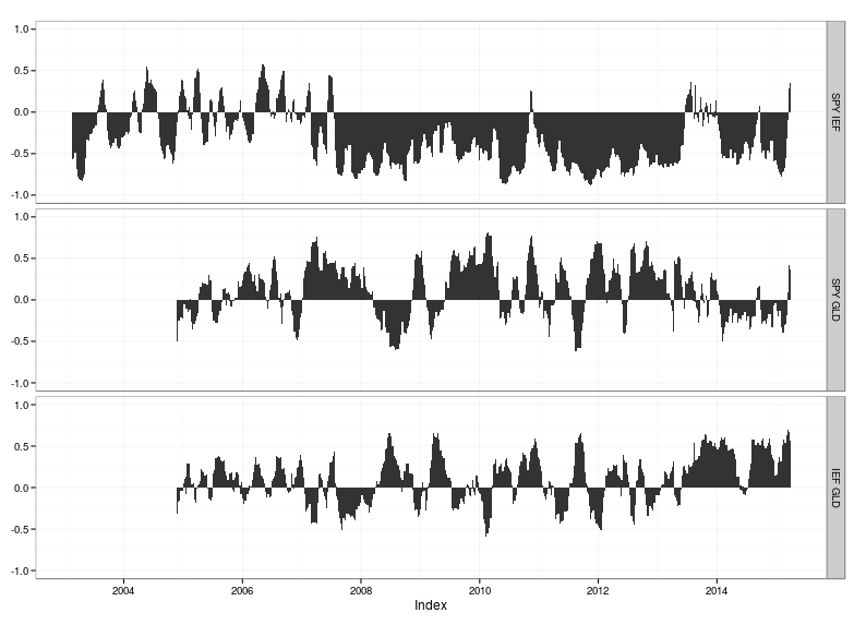
Rolling Correlation
We’ll add a third asset, which is the gold ETF GLD.
gld <- get.hist.quote(instrument="GLD", start="2003-01-01",
                      end=Sys.Date(), quote="AdjClose",
                      provider="yahoo", origin="1970-01-01",
                      compression="d", retclass="zoo")
z <- merge.zoo(spy,ief,gld)
colnames(z) <- c("SPY","IEF","GLD")
z.logrtn <- diff(log(z))
What does the correlation matrix for returns since 2005 (when the GLD series begins) look like?
c <- cor(z.logrtn,use="complete.obs")
> c
            SPY        IEF        GLD
SPY  1.00000000 -0.4124237 0.06083499
IEF -0.41242374  1.0000000 0.10786177
GLD  0.06083499  0.1078618 1.00000000
Note that we’ve removed the missing data in cor() using “complete.obs” which deletes any day for which we don’t have all three prices. Sometimes this is a bit too restrictive so you can use “pairwise.complete” which, for each pair of assets, uses days on which just that pair is available. Unfortunately this means the correlation matrix is no longer guaranteed to be positive definite, but for plotting this isn’t a problem as we won’t be inverting the matrix.
We’re going to flatten the matrix into just the upper triangle with one series per pairwise combination of the columns of z.logrtn. We can use the upper.tri() function to get the upper triangle, and paste() to construct the pairwise column names.
ut <- upper.tri(c)
n <- paste(rownames(c)[row(c)[ut]],rownames(c)[col(c)[ut]])
rollingcorr.1m <- rollapply(z.logrtn,
                            width=30,
                            FUN = function(Z)
                            {
                              return(cor(Z,use="pairwise.complete.obs")[ut])
                            },
                            by.column=FALSE, align="right")
colnames(rollingcorr.1m) <- n

rollingcorr.1m.df <- fortify(rollingcorr.1m,melt=TRUE)

ggplot(rollingcorr.1m.df,aes(x=Index)) +
  geom_ribbon(aes(ymin=0,ymax=Value)) +
  facet_grid(Series~.) +
  ylim(c(-1,1)) +
  theme_bw()
The result below shows that the average correlation is misleading because all three correlations (S&P 500 to Treasuries, S&P 500 to gold and Treasuries to gold) vary widely over time. Even the sign of the correlations flips. If you are a long-term investor, where long-term means decades, then you can use the long-term correlation when thinking about diversification. However if your investment horizon is months or even years then these time-varying correlations mean you have to keep your eye on correlations all the time.